


Hello Beauties!!! I am so excited about these new 2011 Wet n' Wild Color Icon 8-pan palettes!!!
Wet n' Wild has continued to "step up their game" with their amazing 2011 collection. Their 2010 6-pan palettes were fabulous (see previous reviews for: Lust, Pride, Sugar Plum Fairy, Golden Goddess, Snow Sprite, and Night Elf). Will these new 8-pans be just as good??? Well, it sure seems as if they are!
In my area, from what I can tell, the new 8-pans have *replaced* the old 6-pans from the permanent collection. I have mixed feelings about this. While I love the new palettes, it's too bad that the others will no longer be available! So, if you happen upon the old 6-pan ones, and you like them, then you probably want to go ahead and purchase before they are out of stock and impossible to find. My Walgreen's is now displaying the new 8-pans in the same place where the 6-pans were found (as in, there is no longer even a slot, nor price sticker, for the old palettes).
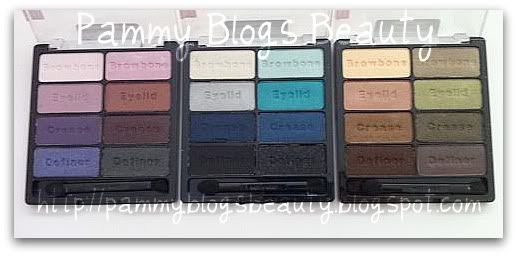
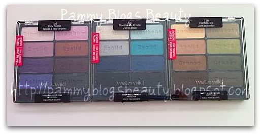
So, with our further ado, on to the review! This review is for the whole collection: (736) Petal Pusher, (737) Blue Had Me At Hello, and (738) Comfort Zone.
For photos, review, swatches, etc...please keep reading after the jump!
Collection at-a-glance:
- The new palettes retail between $4.99 and $7.99. I paid $4.99 each at my Walgreen's, but that may have been a sale price (?) as the display was ticketed at $7.99 each. Honestly, it would "make sense" if they charged more for these palettes than the old 6-pan ones as you get 2 more shadows in the newer palettes. (But, lol, not that I "want" to pay more...so, luckily I didn't!).
- There are only 3 palettes in the new collection. While they are great, and they have a nice range of shades, I just wish there were "more"! Maybe we can reserve some hope for future "special edition" releases??? We can only hope, lol!
- Quality? Value? Yes!!!! You will get both with these palettes. Like the previous WnW Color Icon Palettes, you get a fabulous product for a great price.
- Pigmentation? Awesomely pigmented!!! Now, there is some variation among shades (see swatches below) and across palettes. Generally the darker shades are carrying more pigment and Petal Pusher seems to be generally less pigmented than the others. Not a complaint, just an observation (cause I love Petal Pusher!).
- Texture: These have a great buttery texture. Seriously, "like buttah"! The colors are soft and blendable. I actually find these to be less powdery then the previous color icon palettes (those weren't "that" powdery, but I feel that the texture has improved even more!). You will get a lot of shadow on your brush when you swipe these. The shades with the glitter are a bit more "gritty", but that is to be expected. I can't get over the great texture for such a low price!!! Really, Wet and Wild is continuing to out-do themselves with amazing quality for a drugstore range!!! These shadows can hold their own when compared to high end ranges!
- Finish: Now, this is a bit surprising, there is only one true matte shade in all three palettes! There are a couple that are "almost" matte, but the rest are metallic/glittery/shimmery. I honestly feel that this is the only downside with these palettes. While I totally love shimmer/glitter/sparkle shades, with 8 pans in a palette, you would think that they could "pepper in" a few more matte shades. I mean, one of the strengths of the Wet n Wild Color Icon range is that they do matte shadows soooooo well! I absolutely loved the matte shades that they mixed in with their old Color Icon 6-pan palettes. But, they seem to be going more the way of their Holiday Palettes with all shimmer/glitter/sparkle.
The Organization:
The palettes all have 8 pans. If you divide the palette vertically the column on the left could be a "quad" and the column on the right could be another quad of shadows that all work well together. Now, of course you could always "mix and match", but the shadows are loosely organized into 2 sets of quads in one 8-pan palette.
Each shadow is embossed with a stamp that indicates "Browbone", "Eyelid", "Crease", and "Definer". Your lighter shadows are towards the top with the deeper shadows along the bottom. This really helps application for beginners and just generally keeps you organized! :)
On the back, you get a "key" on the back with some numbered combinations for different makeup "looks" with a diagram for "Sweet", "Flirty", "Dramatic", and "Wild" looks. Honestly, I just use the shadows according to my own personal whims, but you certainly could try one of their pre-formulated ideas. :)
Dupes: Yes, you are going to get some high-end dupes with these palettes (MAC, Too Faced, Urban Decay)!!! I will mention some dupes in the descriptions below, but stay tuned to my blog as I will post more dupes in a future post (way too many photos for this post)! :)
Packaging:
In general, the only "complaint" that I have with Wet n Wild is the cheap packaging. The plastic cases really aren't that sturdy and they scratch very easily. I mean, I guess something has to be sacrificed to produce these high quality shadows at such a low price, but I would actually be happy to pay a "little" more for Wet n Wild if they had nicer packaging. But, hey, you can always depot these and add them to a Z-palette!
Now on to the palette descriptions!!! Drum roll please...
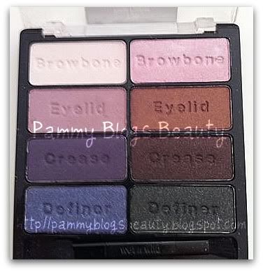
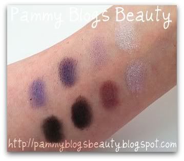
This is your "Purples and Pinks" Palette.
With my obsession with purple shadows lately, this is the one that I was most excited to get, and also the one I seem to be reaching for the most. It is the purples and pinks palette! :)
Left hand side:
- A sheer light pink and a soft lavender that are "close" to matte (but not quite). These are the least pigmented shadows of, it seems, the whole collection. They go on very sheer, but are nice for blending (and super subtle highlighting.
- A plummy deep grayish purple (gorgeous!!! Reminds me of Urban Decay Rockstar, they are not really "dupes" but this one reminds me of a more "purpley" version of Rockstar, which is one of my fave shadows). The duochrome color on this flashes pink or purple depending on the light or can even look more grey. I adore this in the crease!!! My fave shade of the palette, easily!!!
- A sparkly/glittery lavender purple, it has a matte-like base color with the sparkles on top.
- Lovely high frost metallic pink (LOVE this!!! It reminds me of less "pink" version of Pink Freeze). This shade has such a dramatic impact! Totally gives you a foiled look! This is Beautiful on the lid it is a baby pink with just a hint of lavender!!! I love wearing this paired with the plummy purple (crease color from the left hand side: Man, I wish these shades were named!!!). These two shades: the pink and the deep plummy purple are worth getting the whole palette for!!!
- Bronze/reddish-brown with pretty bronze shimmer. The sparkle on this is so pretty!!!
- A beautiful sparkly deep/dark Eggplantish Brownish-Black: applied, this looks like a black with a copperish pink sparkle. Very bold! Great for smokey eyes!
- A sparkly Charcoal/Black: applies as a charcoal grey with iridescent/silver glitter. This one is amazing when used as a liner.
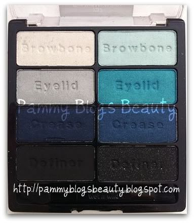
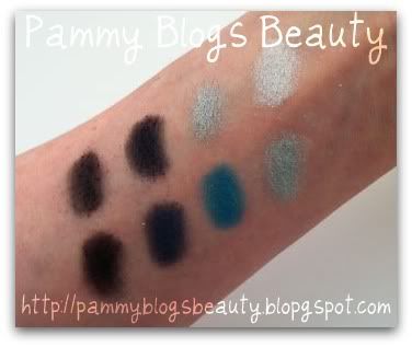
Blue Had Me At Hello (737):
This is your "blues" palette and your "smokey eye palette". Not only do you get some pretty blues, but also some deep dark shades for dramatic smokey eyes!!! If you want some drama, pick up this palette!!!
Left hand side:
- Bright shimmery white highlight shade. You are going to get a ton of shimmer with this one. It is especially beautiful in the inner corners of your eyes.
- A beautiful "true" silver metallic shade. I love using silver metallics on the lid.
- VERY deep black-based blue with blue micro fine glitter sparkle. This applies looking more like a a matte black with a blue sparkle. Very deep color!!! This is really gorgeous as a liner shade.
- TRUE matte black. Super duper pigmentation. This is the ONLY true matte in the entire 8-pan palette series. This is a great matte black easily comparable to Urban Decay's Perversion or Too Faced Stiletto.
- A pastel metallic sky blue. This has a beautiful metallic sheen. This shadow can look either baby blue or white depending on how the light hits it. Nice dimension to this color. I like this applied on the lids or as an inner corner highlight. Super pretty with my blue eyes! ;)
- A true "aqua" color. This blue green is the most vivid and bright "WOW" color of the new palette series! There is soooo much pigment in this one! It is such a beautiful color!!! The metallic finish flashes from blue to green depending on how the light hits.
- A true navy with navy micro glitter sparkle. This is a very deep and rich color. Looks great for a navy smoky eye or as a liner shade. Love it!!!
- Last, but not least, a deep rich black that applies matte and has silver glitter. Super pretty for some dramatic looks.
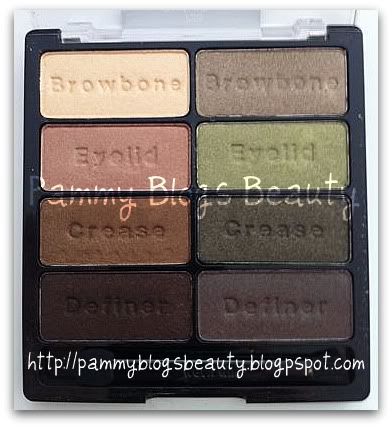
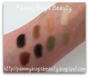
Comfort Zone (738):
This is your "Neutrals Palette". But, not only do you get neutrals, but also some lovely green shades (which are actually very neutral as well!). :) Being a quintessential "neutrals girl", you know I am loving this palette! You have so many options for neutral looks with this one. Plus, I love how blues and greens look with my blue eyes. It really makes the blue color "pop"! :)
Left hand side:
- A shimmery buttery yellow-based cream color for highlight
- A beautiful metallic very light tan/champagne shade which is beautiful on the lid.
- A warm medium brown metallic shade for the crease.
- A sparkly black-based brown definer shade. This one gives you a deep dark black/brown matte base color with tons of copper micro glitter.
Right Hand Side:
- Metallic taupe highlight shade with a bit of a mossy green/olive "sheen" when the light hits it.
- Shiny pea-green with a goldish micro shimmer. OMG, it is so gorgeous on the lid!!!
- Deep dark black-based army green. The base looks somewhat matte with gold and green micro glitter sparkles. This is becoming one of my fav crease colors. VERY pigmented (apply lightly and then blend out, beautiful!!!).
- You all will love this...Its the Too faced Label Whole dupe from the limited edition Night Elf Palette!!! Yes, we have the much sought out shade, so I know that all of you who missed out on the special edition holiday palettes will be very please that this color is included! I know that I am happy to have a duplicate of this great shade!!! It is a medium to dark reddish brown shade that has a green and blue duo chrome shimmer. Truly beautiful and so unique! See my comparison post of this shade vs. Too Faced label Whore here.
So, that's it!!! Whew, what a long post! Thanks for "hanging in there" with me! These are *amazing* palettes!!! I love them all! For the price, Wet n' Wild can't be beat for quality shadows in a unique range of super blendable and unique shades. No "boring" shades with these palettes. You are going to get complex and pigmented shadows! You can create so many beautiful looks with just these three palettes!
Thanks for reading and stay beautiful!!! XOXO!


13 comments:
Hey Priscilla!!! Thanks girl! LOL, you need to start playing with these shadows girl!!! :) they are great! Yes, I def need to start adding EOTD photos. I am getting a little better at self-eye photography, so hopefully some will be ready to post soon!!!
So jealous! I can't find these anywhere. I've checked a few places in the US (not in Canada yet) and had someone check for me but so far nothing. The colours are fabulous. Thanks for the review.
Happy Valentines Day!
xx
Alicia
Oooh these look awesome! Fab range of colours. I'll have to hunt around and see if I can get them here in Aust :)
@FunnyFaceBeauty-Hey Alicia! I hope you can find some soon! I know you will totally love em! :) Happy Valentines Day!!! XOXO!
@Jess-Hi there! I hope you can find these in Aust!!! :)
CVS still carries the 6 pans apparently... but they also don't look like they are getting the 8 pans, so who knows what's going on? It's really confusing! I love your swaches... great review!
@Cydonian-Hey Wendy! LOL, I have been so busy stalking Walgreen's that I haven't checked CVS lately (last time I did they were out of all 6 pans and had no new displays for any new 8-pans)...hmm, interesting, well thats great if those 6 pans are still available there! :)
Wow! I sooo want the Comfort Zone! It's so me!
@GlamaDazzle-Hey Rizzie!!! Yes, agreed! Comfort Zone is very "me" as well. Love it! :)
these swatches are gorgeous! but they're a bit hard to get outside Asia though :/!
thanks Jennifer!
These colors all look amazing! I'm a big scaredy cat when it comes to eyeshadow and always go neutral (meaning cream or taupe). I keep hearing good things about these though so maybe it's time I branched out!
Awesome and very detailed review!! :) I need these palettes, why is WnW doing this to me? lol x
Thanks Satvroula!!! Yes, WnW needs to start selling their products in Greece for you!!! You are going to love these palettes whenever you can get your hands on em! :) So pretty!!! :) XOXO!!!
Post a Comment